or, The Hitchhiker’s Guide to Fear and Loathing at a Public Library Reference Desk


Digital Picture Frames as Informational Signs

   July 21st, 2011 Brian Herzog
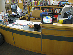
Digital picture frame at the Childrens DeskUsually I'm pretty good at math, but in this case it took me awhile to put two and two together.

Awhile ago, our Childrens Department put a digital picture frame on their desk, using it to display photos of their various programs*. I'd seen and heard of other libraries using digital picture frame like this, and for in-building informational signs (like upcoming events), but I never thought of an application for it at the Reference Desk.

Until a couple weeks ago, when I was in the Apple Store in Boston. I'm not at all an Apple fanboy, but I admit that once in awhile, they come up with a good idea.

A friend of mine was having trouble with her Mac laptop, so we took it to the genius bar to having someone help us with it. I still really like the idea of the genius bar in and of itself, but what got my attention was that, behind the genius bar were great big screens scrolling through tips and information. The messages were all about using or fixing Apple products, which were perfectly targeted at the captive audience of people waiting for the genius bar.

I didn't get any photos myself (Apple is funny about taking pictures in their store), but here are some from the interweb:

Apple Store Genius Bar

You get the idea.

When I saw that, it finally dawned on me - this would be an easy thing for libraries to do at service desks, using a simple digital picture frame. As soon as I can get approval (and funding) to purchase one, I'd like to try one with rotating tips on topics like:

  • how to renew books
  • how to book museum passes
  • using online resources and databases
  • where the bathrooms are
  • online events calendar
  • how to find summer reading books

Really, good topics are anything that might be interesting to someone waiting in line at the Reference Desk.

The "photos" will just be slides created in PowerPoint, and hopefully, having something interesting to look will give patrons waiting in line something to do (in addition to teaching them something they may not have known).

I bet other libraries have already thought of this, so if you're doing it, please comment with how it's working. When I get ours up and running, I'll post an update with how it went.


*They decided to use a digital picture frame rather than flickr or other online service, because they were reluctant to post photos of kids on the internet. Keeping the photos offline and in the Childrens Room was a good compromise (between online or not at all), and it might be more likely for the kids to see themselves, too.


Tags: , , , , , , , , , , , , , , , , ,


Good Example of Effective Signage

   January 11th, 2011 Brian Herzog

I saw this sign in Porter Square Books, and really liked it:

Thank you for feeling at home, but please keep an eye on your things sign

It is simple and to the point, while also welcoming and courteous - which I think is far more effective than harsh or impersonal. Patrons in my library are extremely casual about leaving stuff lying around (i.e., leaving a laptop on a table while they run across the street for lunch), and employing signs like this would remind people that although the library is relatively safe, it is still an open public building.

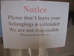
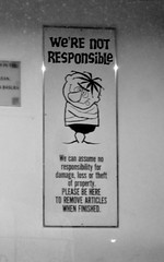
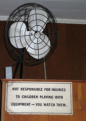
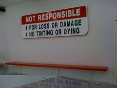
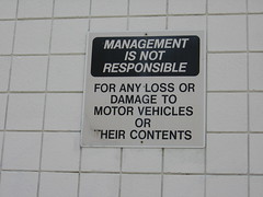
Just for the fun of it, here are some less-friendly (but sometimes funny) examples for caveat patronus signs:

we are not responsible19072008we're not responsibleNot responsibleI wouldn't do that....no tinting or dyingNot on Him."Not Responsible if Seagulls Eat your Funnel Cake" SignNot Responsiblenot responsible for lost articlesnot responsible for your lifeBeware of the Catholics


Tags: , , , , , , , ,


Library Signs, Good and Bad

   April 24th, 2008 Brian Herzog

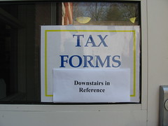
Bad Library SignNow that April 15th has passed, I've started taking down my library's tax forms display, and all the signs in the library pointing to it.

I found the sign pictured here taped to the library's front door, which got me thinking about good and bad library signs. This is definitely a bad sign - questionable colors, second sign taped over top, and remnants of tape from when it was hung last year. I hadn't noticed this one before, which is what I get for using the staff entrance (we should all use the patron entrance more often to see what the public sees). I'm all for recycling, but we can definitely do better.

When it comes to signs, I think the fewer the better. Over the last two years, I have secretly been taking down signs in my library - no one has seemed to notice, and the library looks a lot cleaner.

I'm always interested in signs and marketing, so here are other examples of good and bad library signs - check out the Library Signage flickr group for more:

Good

Bad

  • Don't Touch Sign - not only overly-negative, but counter-productive
  • No Cutting or Gluing - I guess the sign just supports a policy, so it's actually the policy I don't understand
  • Don't Move Tables - I don't like how totally inflexible this one is; librarians don't always think of everything
  • Turn Off Cell Phone! - way too negative! And emphatic!
  • Cell Phones are Silent - I like the funny graphic, and that the words don't outlaw cell phones entirely, but I'm not a fan of the big red circle-slash, and in this case it sends a mixed message


Tags: , , , , , , , ,